Componentizing Workflow for Angular
$1
Yesterday I wrote a tweet about how I usually create components.
Great workflow for refactoring unwieldy components :-)
https://t.co/each4c2cm9
— Kent C. Dodds (@kentcdodds) December 9, 2015
A tweet is quite short, so let’s take a closer look at such workflow in more detail. Also, note that I’m using Angular components here, but this holds in many other contexts as well, Angular 1.x, React,…
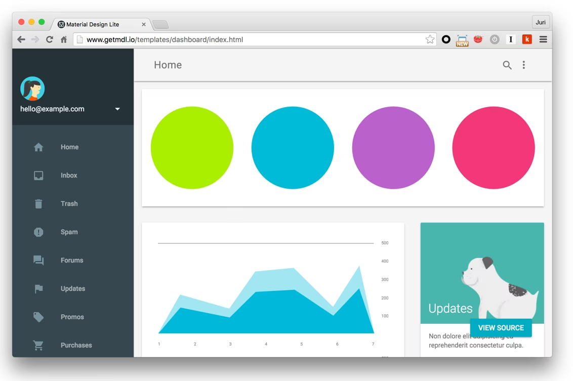
When you start a new application, most often you get a static document from your UI design team, or you start from some predefined template. That said, you need to have a strategy for decomposing that huge static HTML block into smaller components.
My workflow usually consists in
- Create a component containing that huge static HTML block
- Identify reusable or autonomous parts
- Extract those parts into separate components
- Iterate, goto step 2.
1. The big component
So at step 1 you’ll get something like this.
@Component({
  selector: 'app-main',
  template: `
    <div
      class="demo-layout mdl-layout mdl-js-layout mdl-layout--fixed-drawer mdl-layout--fixed-header has-drawer is-upgraded"
      data-upgraded=",MaterialLayout"
    >
      <header
        class="demo-header mdl-layout__header mdl-color--grey-100 mdl-color-text--grey-600 is-casting-shadow"
      >
        <div class="mdl-layout__drawer-button">
          <i class="material-icons">menu</i>
        </div>
        <div class="mdl-layout__header-row">
          <span class="mdl-layout-title">Home</span>
          <div class="mdl-layout-spacer"></div>
          <div
            class="mdl-textfield mdl-js-textfield mdl-textfield--expandable is-upgraded"
            data-upgraded=",MaterialTextfield"
          >
            <label
              class="mdl-button mdl-js-button mdl-button--icon"
              for="search"
              data-upgraded=",MaterialButton"
            >
              <i class="material-icons">search</i>
            </label>
            <div class="mdl-textfield__expandable-holder">
              <input class="mdl-textfield__input" type="text" id="search" />
              <label class="mdl-textfield__label" for="search"
                >Enter your query...</label
              >
            </div>
          </div>
          <button
            class="mdl-button mdl-js-button mdl-js-ripple-effect mdl-button--icon"
            id="hdrbtn"
            data-upgraded=",MaterialButton,MaterialRipple"
          >
            <i class="material-icons">more_vert</i>
            <span class="mdl-button__ripple-container">
              <span class="mdl-ripple"></span>
            </span>
          </button>
          <div class="mdl-menu__container is-upgraded">
            <div class="mdl-menu__outline mdl-menu--bottom-right"></div>
            <ul
              class="mdl-menu mdl-js-menu mdl-js-ripple-effect mdl-menu--bottom-right mdl-js-ripple-effect--ignore-events"
              for="hdrbtn"
              data-upgraded=",MaterialMenu,MaterialRipple"
            >
              <li
                class="mdl-menu__item mdl-js-ripple-effect"
                tabindex="-1"
                data-upgraded=",MaterialRipple"
              >
                About
                <span class="mdl-menu__item-ripple-container">
                  <span class="mdl-ripple"></span>
                </span>
              </li>
              <li
                class="mdl-menu__item mdl-js-ripple-effect"
                tabindex="-1"
                data-upgraded=",MaterialRipple"
              >
                Contact
                <span class="mdl-menu__item-ripple-container">
                  <span class="mdl-ripple"></span>
                </span>
              </li>
              <li
                class="mdl-menu__item mdl-js-ripple-effect"
                tabindex="-1"
                data-upgraded=",MaterialRipple"
              >
                Legal information
                <span class="mdl-menu__item-ripple-container">
                  <span class="mdl-ripple"></span>
                </span>
              </li>
            </ul>
          </div>
        </div>
      </header>
      <div
        class="demo-drawer mdl-layout__drawer mdl-color--blue-grey-900 mdl-color-text--blue-grey-50"
      >
        <header class="demo-drawer-header">
          <img src="images/user.jpg" class="demo-avatar" />
          <div class="demo-avatar-dropdown">
            <span>[email protected]</span>
            <div class="mdl-layout-spacer"></div>
            ...
            <div class="mdl-menu__container is-upgraded">
              <div class="mdl-menu__outline mdl-menu--bottom-right"></div>
              ...
            </div>
          </div>
        </header>
        <nav class="demo-navigation mdl-navigation mdl-color--blue-grey-800">
          <a class="mdl-navigation__link" href="">
            <i
              class="mdl-color-text--blue-grey-400 material-icons"
              role="presentation"
              >home</i
            >
            Home
          </a>
          <a class="mdl-navigation__link" href="">
            <i
              class="mdl-color-text--blue-grey-400 material-icons"
              role="presentation"
              >inbox</i
            >
            Inbox
          </a>
        </nav>
      </div>
      <main class="mdl-layout__content mdl-color--grey-100">
        <div class="mdl-grid demo-content">
          <div
            class="demo-charts mdl-color--white mdl-shadow--2dp mdl-cell mdl-cell--12-col mdl-grid"
          >
            <svg
              fill="currentColor"
              width="200px"
              height="200px"
              viewBox="0 0 1 1"
              class="demo-chart mdl-cell mdl-cell--4-col mdl-cell--3-col-desktop"
            >
              ...
            </svg>
            <svg
              fill="currentColor"
              width="200px"
              height="200px"
              viewBox="0 0 1 1"
              class="demo-chart mdl-cell mdl-cell--4-col mdl-cell--3-col-desktop"
            >
              ...
            </svg>
          </div>
          ...
        </div>
      </main>
    </div>
  `,
})
export class MainCmp {}
Totally not comprehensible, nor maintainable. Also, don’t fall into the trap of simply externalizing this into an HTML page and you’re done, like..
@Component({
  selector: 'app-main',
  templateUrl: './main.html',
})
export class MainCmp {}
Neat, right. Well, no, you’re just hiding the crap 😉.
2. Identify components
For a first high level overview, the best is to look at the static HTML page of our huge app-main component.

When I look at this I can immediately spot
- a header area
- a main area/dashboard
- a sidebar area
3. Extract new components and re-assemble
Once we’ve identified the components, we can start creating new ones and extract the according HTML parts into them.
// header component file
@Component({
  selector: 'app-header',
  template: `
    <div class="mdl-layout__drawer-button"> <i class="material-icons">menu</i>
    </div>
    <div class="mdl-layout__header-row">
      <span class="mdl-layout-title">Home</span>
      <div class="mdl-layout-spacer"></div>
      <div class="mdl-textfield mdl-js-textfield mdl-textfield--expandable is-upgraded" data-upgraded=",MaterialTextfield">
        <label class="mdl-button mdl-js-button mdl-button--icon" for="search" data-upgraded=",MaterialButton"> <i class="material-icons">search</i>
        </label>
        <div class="mdl-textfield__expandable-holder">
          <input class="mdl-textfield__input" type="text" id="search">
          <label class="mdl-textfield__label" for="search">Enter your query...</label>
        </div>
      </div>
      <button class="mdl-button mdl-js-button mdl-js-ripple-effect mdl-button--icon" id="hdrbtn" data-upgraded=",MaterialButton,MaterialRipple">
        <i class="material-icons">more_vert</i>
        <span class="mdl-button__ripple-container">
          <span class="mdl-ripple"></span>
        </span>
      </button>
      <div class="mdl-menu__container is-upgraded">
        <div class="mdl-menu__outline mdl-menu--bottom-right"></div>
        <ul class="mdl-menu mdl-js-menu mdl-js-ripple-effect mdl-menu--bottom-right mdl-js-ripple-effect--ignore-events" for="hdrbtn" data-upgraded=",MaterialMenu,MaterialRipple">
          <li class="mdl-menu__item mdl-js-ripple-effect" tabindex="-1" data-upgraded=",MaterialRipple">
            About
            <span class="mdl-menu__item-ripple-container">
              <span class="mdl-ripple"></span>
            </span>
          </li>
          <li class="mdl-menu__item mdl-js-ripple-effect" tabindex="-1" data-upgraded=",MaterialRipple">
            Contact
            <span class="mdl-menu__item-ripple-container">
              <span class="mdl-ripple"></span>
            </span>
          </li>
          <li class="mdl-menu__item mdl-js-ripple-effect" tabindex="-1" data-upgraded=",MaterialRipple">
            Legal information
            <span class="mdl-menu__item-ripple-container">
              <span class="mdl-ripple"></span>
            </span>
          </li>
        </ul>
      </div>
    </div>
  `
})
export class HeaderCmp {}
You repeat the same for our sidebar and main area dashboard. Finally we should get something like this.
import { HeaderCmp } from './app-header';
import { SidebarCmp } from './app-sidebar';
import { DashboardCmp } from './app-dashboard';

@Component({
  selector: 'app',
  template: `
    <div
      class="demo-layout mdl-layout mdl-js-layout mdl-layout--fixed-drawer mdl-layout--fixed-header has-drawer is-upgraded"
      data-upgraded=",MaterialLayout"
    >
      <app-header
        class="demo-header mdl-layout__header mdl-color--grey-100 mdl-color-text--grey-600 is-casting-shadow"
      >
      </app-header>

      <app-sidebar
        class="demo-drawer mdl-layout__drawer mdl-color--blue-grey-900 mdl-color-text--blue-grey-50"
      >
      </app-sidebar>

      <app-main class="mdl-layout__content mdl-color--grey-100"> </app-main>
    </div>
  `,
})
export class MainCmp {}
4. Iterate
Obviously, these components are still way too large. So iterate, basically go back to step 2, take the first component (i.e. our app-header) and extract it into separate ones again, until you get to a point where you have reasonable-sized components.
During such process you may naturally even arrive at components so generic that they’re reusable across multiple applications. So you could even extract them into a separate, dedicated library.
Conclusion
I think you got the main idea. Obviously you’ll do the extract and re-compose in a much quicker way after a while, even in your head “in-memory” :smiley:, but the concept is this basically.
Back when I was a student at the university, when they explained us the concept of recursion in algorithms, they presented the concept of “divide and conquer”. From now and then I get reminded to that as it is very much the same here. You take a piece, extract it and then assemble it back into the main part.
Also check out my video course on “Learning Angular directives”. Here’s a preview of a section where I applied some of the concepts demonstrated in this article here.

Stay in the loop
Don't miss any of my content. No spam. I'm not a grifter.